Branding
Our branding process is as meticulous as Spittia Solutions cleaning methods. We began by immersing ourselves in the essence of the company, understanding its core values, mission, and unique selling points
category:
services:
Design
Date:
team:
Designer - Tim Willson

Description & Defining
We embarked on a journey of color exploration, carefully selecting hues that resonated with Spittia’s commitment to cleanliness, professionalism, and efficiency.
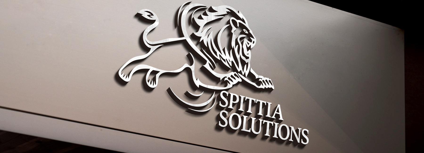
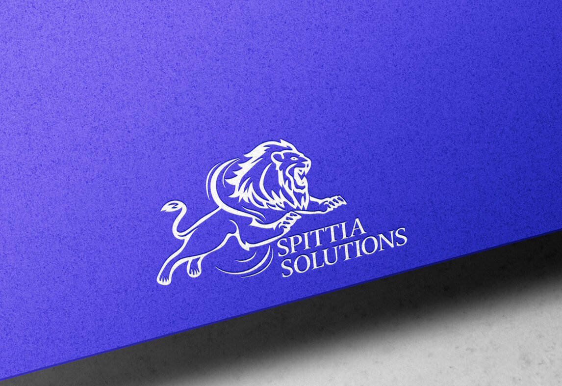
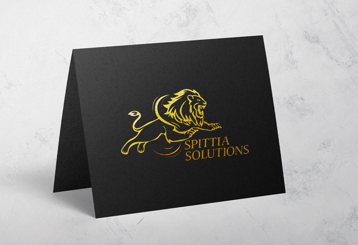
After extensive research and deliberation, we settled on a palette that exuded trustworthiness and reliability, with shades of crisp blues and pristine whites dominating the visual identity. These colors not only conveyed a sense of cleanliness but also evoked a feeling of freshness and clarity, aligning perfectly with Spittia’s brand ethos. Additionally we crafted a sleek and modern logo that encapsulated the company’s dedication to precision and excellence, serving as a visual representation of its core values. A Through this thoughtful and strategic approach to branding, Spittia Solutions emerged with a distinct and memorable identity that set it apart in the competitive landscape of industrial kitchen cleaning..
Challenge & Solution
Spittia Solutions, an industrial kitchen cleaning company, faced the challenge of establishing a strong brand presence that differentiated them in a competitive market. Their existing branding lacked cohesion and failed to convey their commitment to professionalism and reliability.
A comprehensive branding overhaul.Christina Grant
We began by conducting an in-depth analysis of their brand identity, mission, and target audience. Leveraging this insight, we crafted a fresh and cohesive visual identity that reflected Spittia’s values of cleanliness, professionalism, and efficiency.
Through strategic branding initiatives, Spittia Solutions emerged with a distinct and memorable identity that positioned them as a leader in the industrial kitchen cleaning industry.


